Double Digits
Our countdown to our tentative opening date has dropped down into the double digits, meaning we're now less than 100 days away from skiing and riding at Snowriver. While there is still much to do across both mountains, they have already seen significant changes to their layouts. When the mountains change, so must the map. Our marketing team has been working with VistaMap diligently over the past few months to craft an all-new trail map for the upcoming ski season. Gary from VistaMap is a digital artist that has developed maps for ski areas across the country including our sister resort, Granite Peak. I'm a big fan of his work and can't wait to see how he portrays these two great mountains. Read on for an update on his progress so far and to get a sneak peek of the brand-new map.
Rough Draft
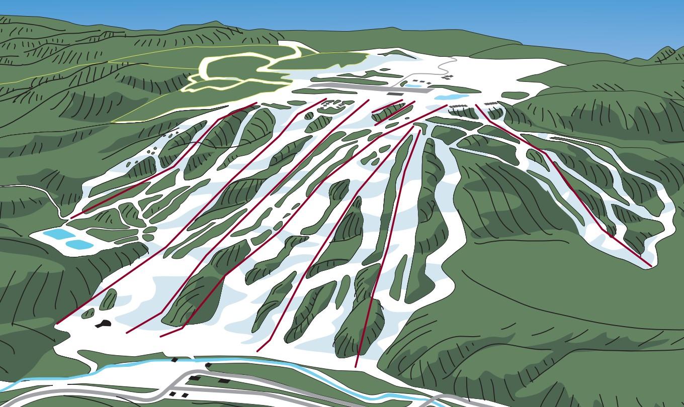
Just like your high school English papers, the process starts with a rough draft. Gary gathers information from satellite imagery, existing maps, and photos to create the first version of the new map. His focus in this stage is to create the base layer from the vantage point that best orients the viewer to understand the layout of the entire resort. Upon our review of this draft, our feedback was used to determine how much background to show, which lifts needed to be removed, and how the two mountains should be shown in relationship to one another.
1st Revision
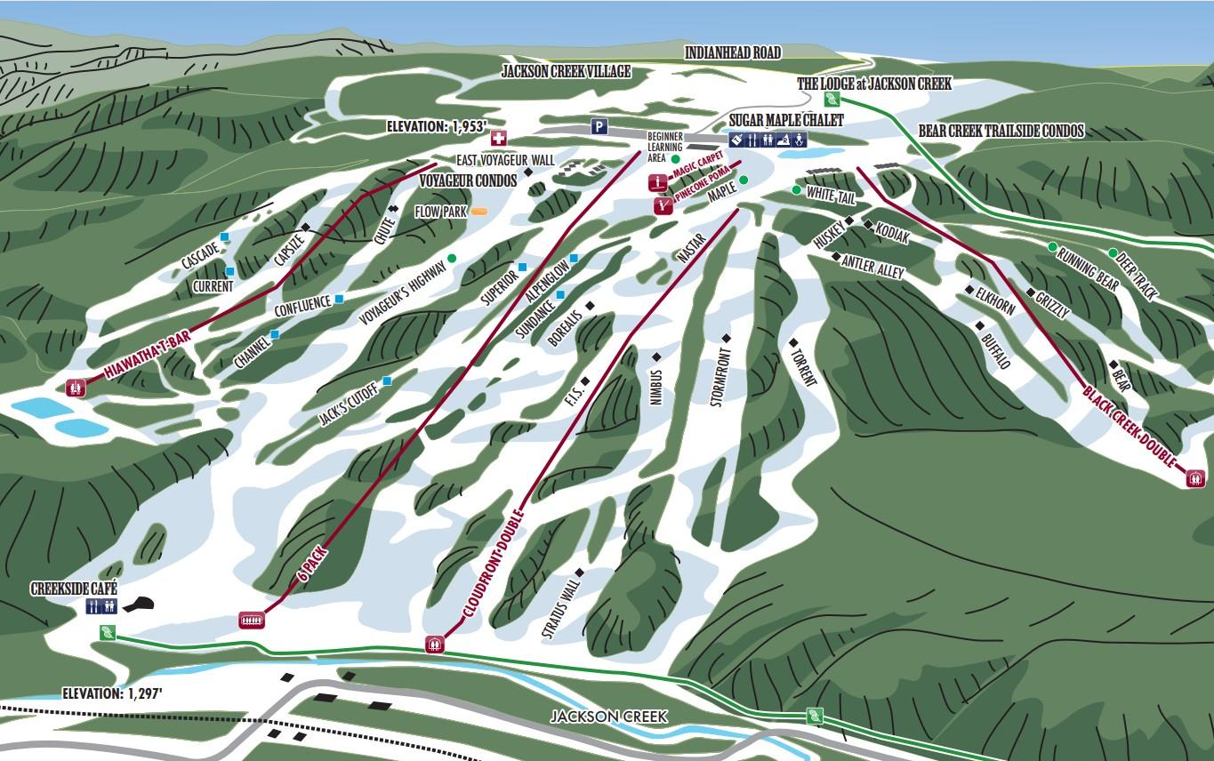
After the base layer is approved by our team, the process continues with the addition of labels for runs, lifts, buildings, and landmarks. In this stage, we start to get a better feel of how the map will be used for navigation, which guides us in fine-tuning the various shapes to portray the mountain in a way that feels right from a skier's perspective. In some cases that means diverging slightly from reality, to ensure that the steep sections truly look steep and the fall lines are exaggerated enough to come across in print. This is where the true art of the process comes out. Gary interprets our feedback to clearly portray the way the mountain feels to skiers and riders. Rather than simply creating a flat, exact copy of a satellite photo, he uses shadows and color variation to evoke the correct sense of place unique to our terrain.
Updates & Changes
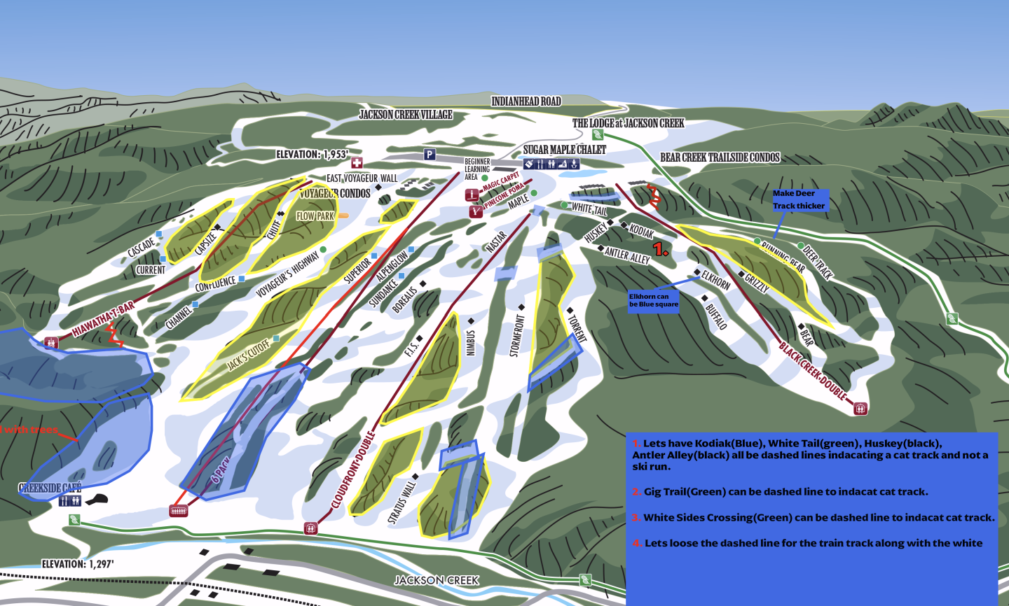
The design process is very iterative, requiring a lot of back and forth between Gary and our on-site team here at Snowriver. This screenshot shows an example of one of the images we sent back to help refine the updated layout of the trail system. Areas highlighted in blue represented areas where changes to the wooded areas were necessary, yellow the areas that needed to be thinned to show glading that is being done and the red numbers correspond to specific notes we'd written.
Buildings and Landmarks
With the overall layout of the mountain coming together, the next step was to have each of the various buildings and landmarks designed. Gary likes to make the buildings as realistic as possible so they can be used as a navigational reference when looking at the map. To get them right, our photography wizard Kyle took photos of all the buildings and important landmarks, labeled them accordingly, and sent them off. As you can see in the gallery below, the ones that have been completed so far are really looking great.
Placing of the Trees
As we inch closer and closer towards the finished product the level of detail continues to increase. With the shape of the slopes and the placement of the buildings mostly complete, Gary moves on to the placement of the individual trees. This is when the map starts to come alive for me. I appreciate the way he pays close attention to the location of the various types of trees, placing coniferous trees and deciduous trees in their correct locations based on satellite imagery. While there's still some fine-tuning to complete, we're getting very close to wrapping it up and sending it off to the printers.


